Neon Film & Arts is a collective of film and art enthusiasts who launched an online platform in 2017, where they share film and art
related news and essays. They approached me looking for a new look that would make them stand out amongst other online news outlets that cover similar topics.
Their branding at the time used dark blue/grey colours and a serious tone, and wasn’t immediately recognisable
as a creative business. They asked for colour and boldness that would appeal to a young audience
passionate about art and film.

Development
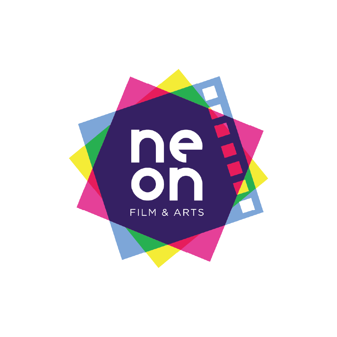
The “Neon” text is a custom font based on a circle, which references the collective, the community and the inclusivity that the brand strives for.
For the visual elements, I was inspired by the texture of film and the coloured lens filters used in film-making: the overlapping tinted shapes creates depth and opens up the possibilities of interesting colour combinations.
Strategy
The client requested a colourful, fresh design
with a focus on digital usage - particularly designed
for Instagram and their website.
I chose to use
different colour combinations for different categories of Neon’s website and news: for example blue and pink for everything film, pink and orange for reviews, and so on.


About the brand
Neon Film & Arts is a collective of film and art enthusiasts who launched an online platform in 2017, where they share film and art related news and essays.
They approached me looking for a new look that would make them stand out amongst other online news outlets that cover similar topics.
Their branding at the time used dark blue/grey colours and a serious tone, and wasn’t immediately recognisable as a creative business. They asked for colour and boldness
that would appeal to a young audience passionate about art and film.


Development
The “Neon” text is a custom font based on a circle, which references the collective, the community and the inclusivity that the brand strives for.
For the visual elements, I was inspired by the texture of film and the coloured lens filters used in film-making: the overlapping tinted shapes creates depth and opens up the possibilities of interesting colour combinations.
Strategy
The client requested a colourful, fresh design with a focus on digital usage - particularly designed for Instagram
and their website.
I chose to use different colour combinations for different categories of Neon’s website and news: for example blue and pink for everything film, pink and orange for reviews, and so on.

Slide title
Write your caption hereButton
Slide title
Write your caption hereButton
Slide title
Write your caption hereButton
Slide title
Write your caption hereButton
Slide title
Write your caption hereButton


